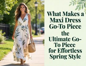
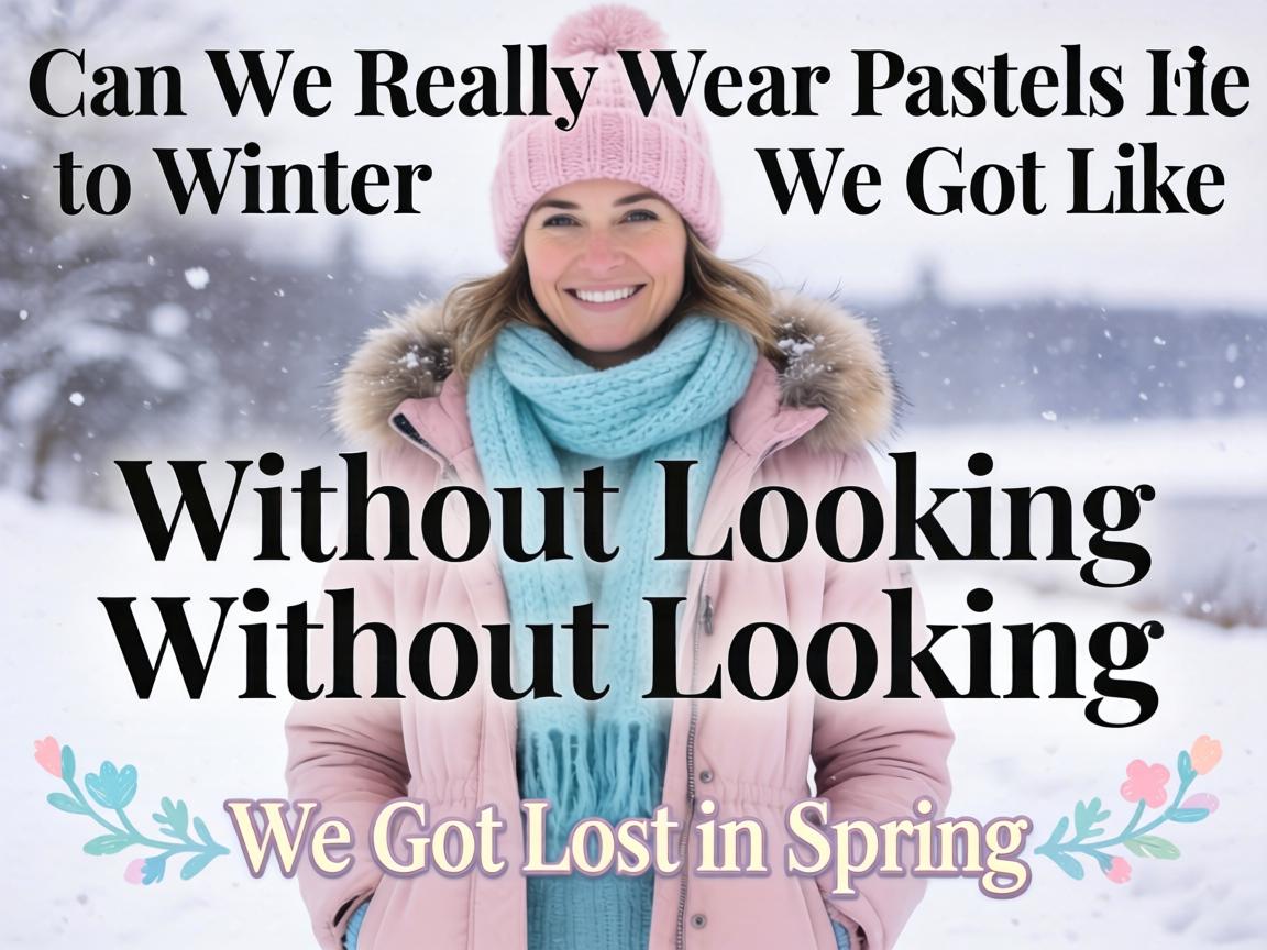
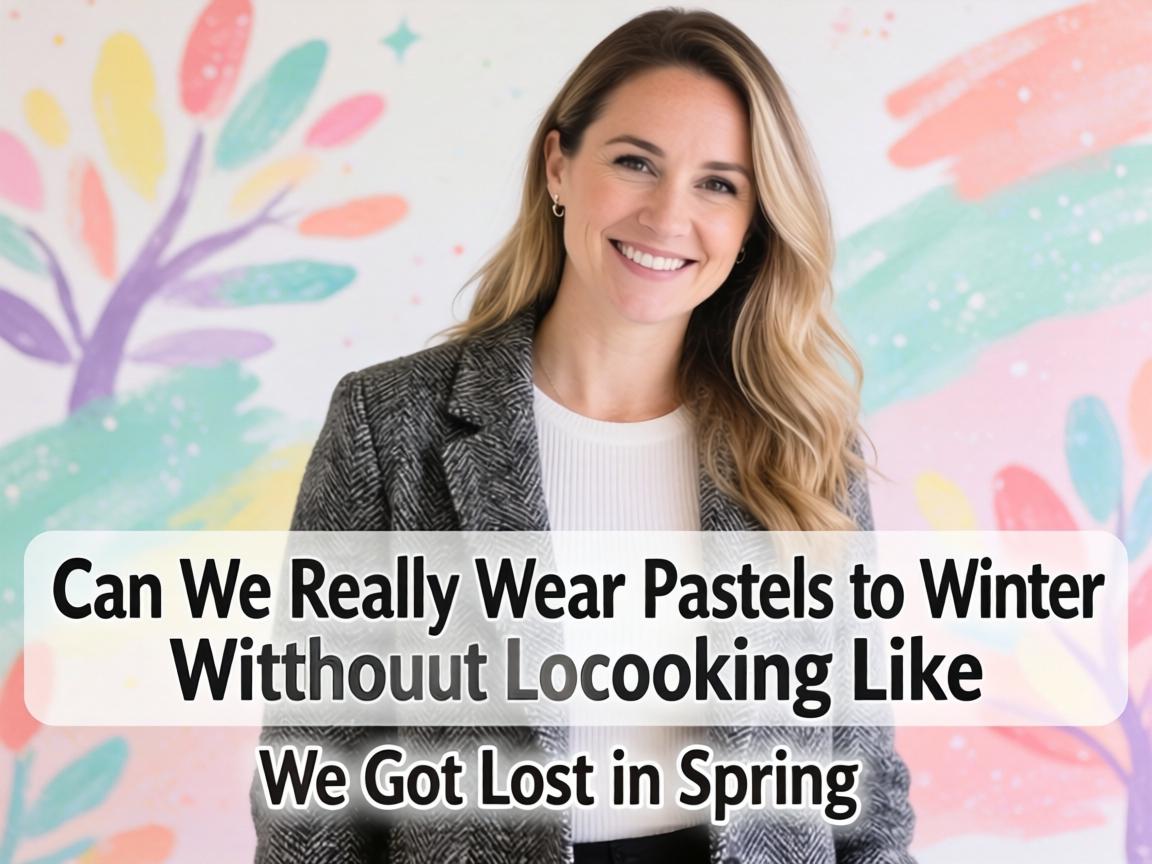
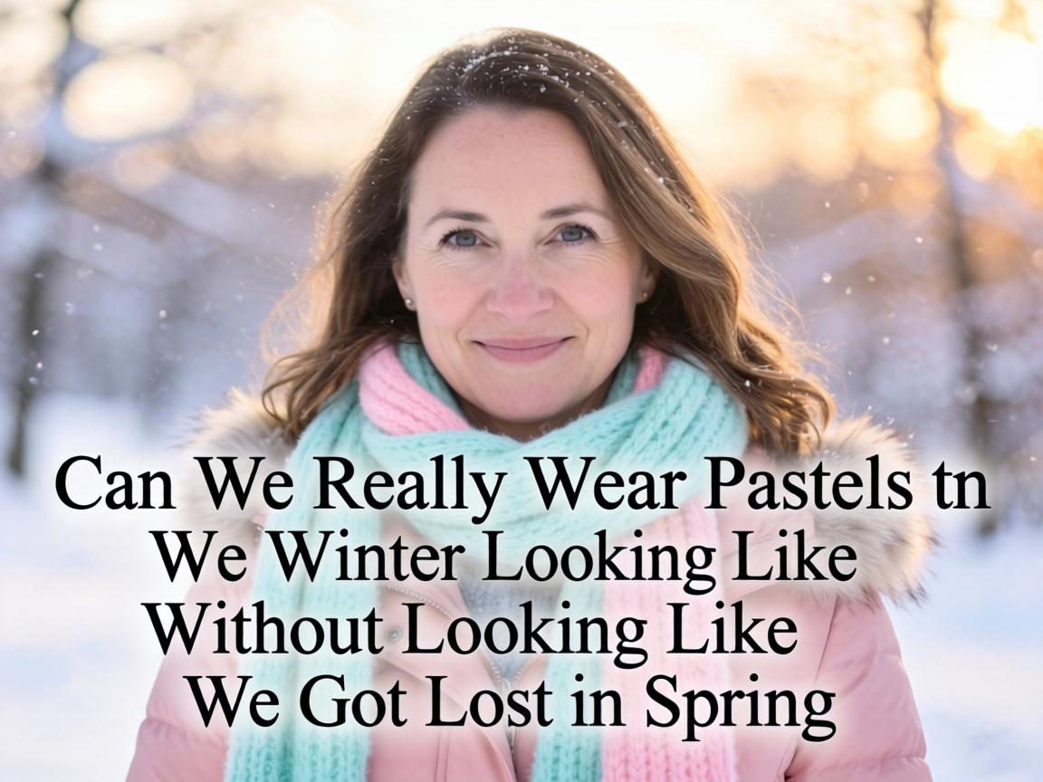
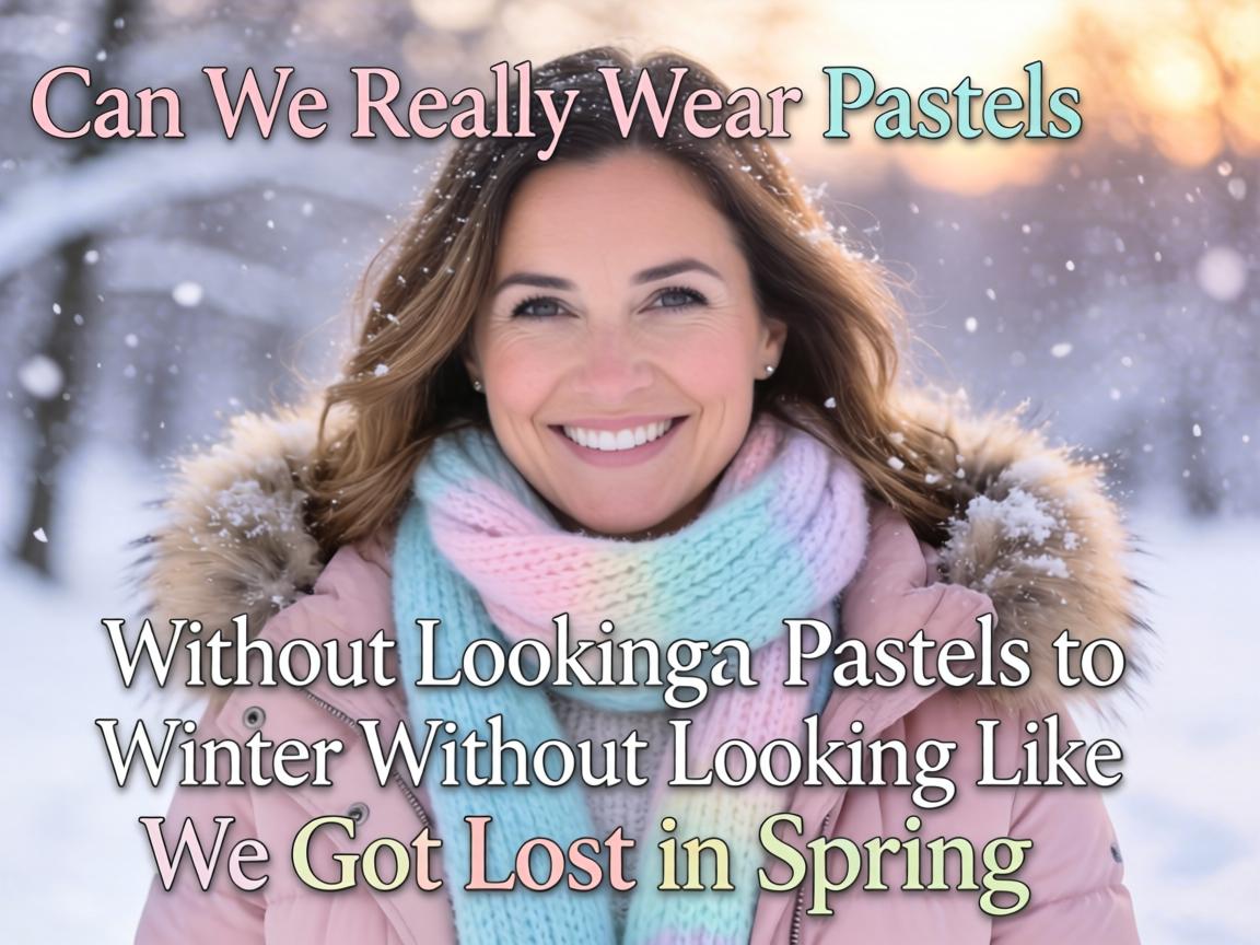
So here’s the thing, guys. Every year around October, fashion editors start screaming about “winter wardrobes” and suddenly everything turns charcoal, burgundy, and… honestly? Kind of boring. But pastel colors for winter 2024
are having this weird, quiet moment that nobody saw coming. You might be wondering, “Wait, isn’t that breaking some unwritten rule?” And honestly? Maybe. But let’s be real—the best outfits always do.I kept seeing these soft lavender coats
and butter yellow knits
popping up on my feed, and at first I thought it was just another algorithm glitch. You know, like when TikTok shows you beach content in December because you watched one video about Cancun three years ago. But nope. This is actually happening. From the runway shows in Milan
to those street style shots outside London Fashion Week, pastels are refusing to hibernate.What does this mean for the season?
Well, for starters, it means we don’t have to look like everyone else in the coffee line wearing identical black puffer jackets. There’s something kind of rebellious about wearing powder blue
when it’s 35 degrees out. It feels intentional. It feels expensive, actually—even when it’s not.A lot of people ask me about the practical side. “Won’t pastels get dirty?” Sure, if you’re rolling in slush. But here’s what I think: winter white
has been a thing forever, and nobody panics about that. The trick is fabric choice. Wool blends
, structured satins
, and even some treated leathers
in these soft hues actually hide wear better than you’d expect. Plus, dry cleaning exists for a reason. Let’s not pretend we weren’t already doing that with our camel coats.Let me break down what I’m actually seeing work in real life, not just on models who don’t take the subway:
| Style Approach | Vibe | Best For |
|---|---|---|
| Monochrome pastel
(head-to-toe lilac or mint) |
Very editorial, slightly risky | Fashion week, creative offices |
| One statement piece
(pink coat, rest neutral) |
Approachable, still interesting | Daily wear, brunch, dates |
| Pastel accessories
(scarves, bags, gloves) |
Safe entry point | Testing the trend without commitment |
| Mixed pastels
(lavender + pale yellow) |
Advanced, needs confidence | Street style moments, content creation |
Most people don’t notice that the key to making this work is texture contrast
. A flat pastel polyester? Looks cheap, sorry. But a fuzzy mohair cardigan in dusty rose
? Suddenly you’re in a completely different conversation. The eye reads it as luxurious because the texture adds depth that the color alone can’t carry.You might be wondering about skin tone compatibility. Here’s where I get a little controversial—I think pastels in winter actually work better on more people than summer pastels do
. Something about the grey light of January makes these softer shades glow instead of wash out. Maybe it’s the lack of harsh sun? I’m not a scientist, just someone who spends too much time analyzing mirror selfies.From my view, the brands getting this right are doing something interesting: they’re pairing these colors with heavy hardware
. Think pale blue coats with chunky silver zippers
, or mint green bags with industrial chain straps
. That tension between soft color and tough details? That’s what keeps it from looking like Easter threw up on your outfit.Keep reading, because I want to talk about the psychology here for a second. There’s actual research (okay, fashion marketing research, but still) showing that wearing unexpected colors in gloomy months boosts not just your mood but how others perceive your confidence. It’s like a visual flex. “I’m so secure in my style that I don’t need to follow your seasonal rules.” That energy is contagious.A few quick hits on what’s actually worth buying:
- Oversized pastel scarves
– easiest way in, works with your existing coats
- Structured blazers in soft sage or peach
– office appropriate but not boring
- Cropped pastel cardigans
– layer over turtlenecks, very current
- Pastel leather or pleather
– surprisingly versatile, adds edge
What does this mean for the season? Honestly, I think we’re seeing the early stages of color normalization
—the idea that any color can work any time if you style it with intention. The old fashion calendar is crumbling, and good riddance. Remember when you “couldn’t” wear white after Labor Day? Exactly.You might be wondering if this is just a trend that’ll look dated by next year. And… maybe? But here’s what I think: pastels have been coming back every 3-4 years since like 2012. At this point, they’re less a trend and more a seasonal option
we’ve been trained to ignore. The difference now is people are finally brave enough to wear them when it’s cold.A lot of people ask about footwear. Pastel boots
are tricky—I’ll admit that. But a soft lilac sneaker
with winter whites? Or pale pink loafers
with grey wool trousers? That works. It keeps the look grounded in reality instead of costume territory.From my view, the biggest mistake people make is treating pastels like they’re fragile. They lean too dainty with the rest of the outfit—pearls, ballet flats, tiny handbags. No. You need weight
. Chunky boots
. Oversized silhouettes
. Heavy knits
. The contrast is what makes it modern instead of precious.Most people don’t notice that lighting matters too. These colors photograph beautifully in that flat, grey winter light—much better than black, which can look like a void in photos. If you’re someone who cares about your digital presence (and let’s be real, who isn’t at this point), that’s not nothing.Let’s be real for a second. Fashion is supposed to be fun. We spend months in functional, depressing clothing because of “weather” and “practicality.” But if a butter yellow coat
makes you actually want to leave your apartment in February? That’s worth something. The utility of joy is underrated.I keep thinking about that phrase “dress for the job you want.” Maybe we should start dressing for the season we want
, not just the one we’re stuck in. A little visual denial never hurt anyone. And honestly, seeing someone in pale pink against a backdrop of dirty snow? That’s art. That’s hope. That’s fashion doing what it’s supposed to do—transforming the mundane into something worth looking at
.So yeah. Can we wear pastels in winter? Obviously. Should we? If you want to. The rules were always made up anyway. Just maybe avoid the pastel parka if you’re actually going skiing. Some practical limits still apply.